Logo Design
Client
Blue Tee Management
Project
Blue Tee Management is an investment management firm headquartered in Boston, MA. Their professional experience extends to companies of all sizes and complexity; from start-ups to Fortune 500. They offer advisory and consulting services in finance, business strategy, investment expertise in equities, bonds, real estate, private/venture equity, and alternative investments.
They wanted their new logo to convey a casual-professional and forward-thinking image that would appeal to retired, yet sophisticated investors as well as burgeoning corporate clients that need advice with business and financing strategies. Further, they wanted the logo design to convey a sense of the clear, deliberate & objective advice they offer their clients.
The name Blue Tee Management is golf-inspired, so they wanted the logo design to reflect that. They explained that “the blue tees are typically further back, which makes the hole more difficult or challenging. Blue tees are typically higher and allow one to see the playing ground or field more clearly above the fray or confusion that may lie below them. We are not afraid of a challenge or complexity; the prospect of taking on challenging projects, investment strategies or ideas doesn’t intimidate us. The position from the blue tees allows one to be more thoughtful and strategic. We picture ourselves as the caddie helping the golfer spot opportunities and challenges to ensure greater success from this heightened position/tee.”
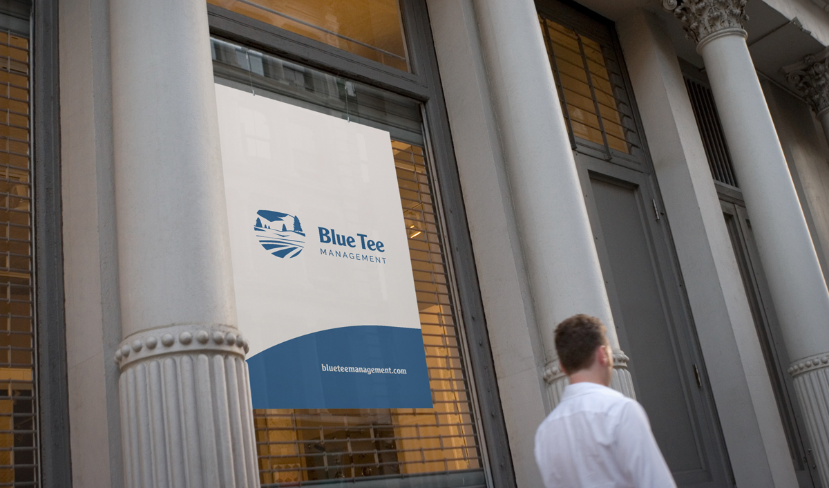
I created three logo concepts using the golf theme. The idea of illustrating the “heightened position” of the blue tees seemed to represent best the challenges they are eager to take on as well as the thoughtful and strategic advice they offer, so they chose to explore this concept further. The icon illustrates a panoramic view of a golf course with a blue tee hilltop in the background. The three stripes at the bottom represent grass lines on a hilly golf course. In addition, all lines on this icon move your eyes towards the lettering, conveying deliberate forward movement.
Feedback
"I have to commend Del on the work he's done. It was difficult to choose one logo to move forward with since all three concepts had different elements that really appealed to us. The final logo is perfect. Exactly what we were looking for. Thank you for taking the time to flesh all of this out and for being so amenable to our suggestions. Really stellar work."
Brendan Cronin / Client
Final Logo Design
Logo Design Sketches
Logo Design Concepts
Logo Design Progression
Logo Design Presentation
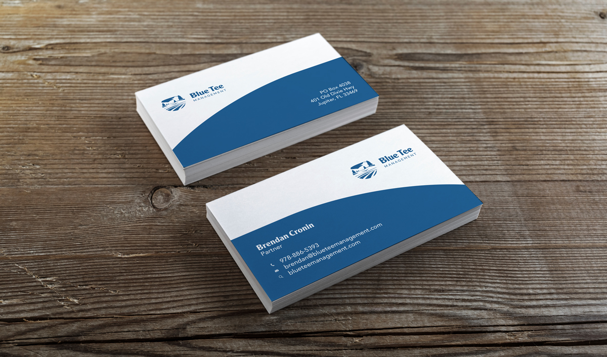
Business Card Design
Branding