Logo Design
Client
New Look Refinishing
Project
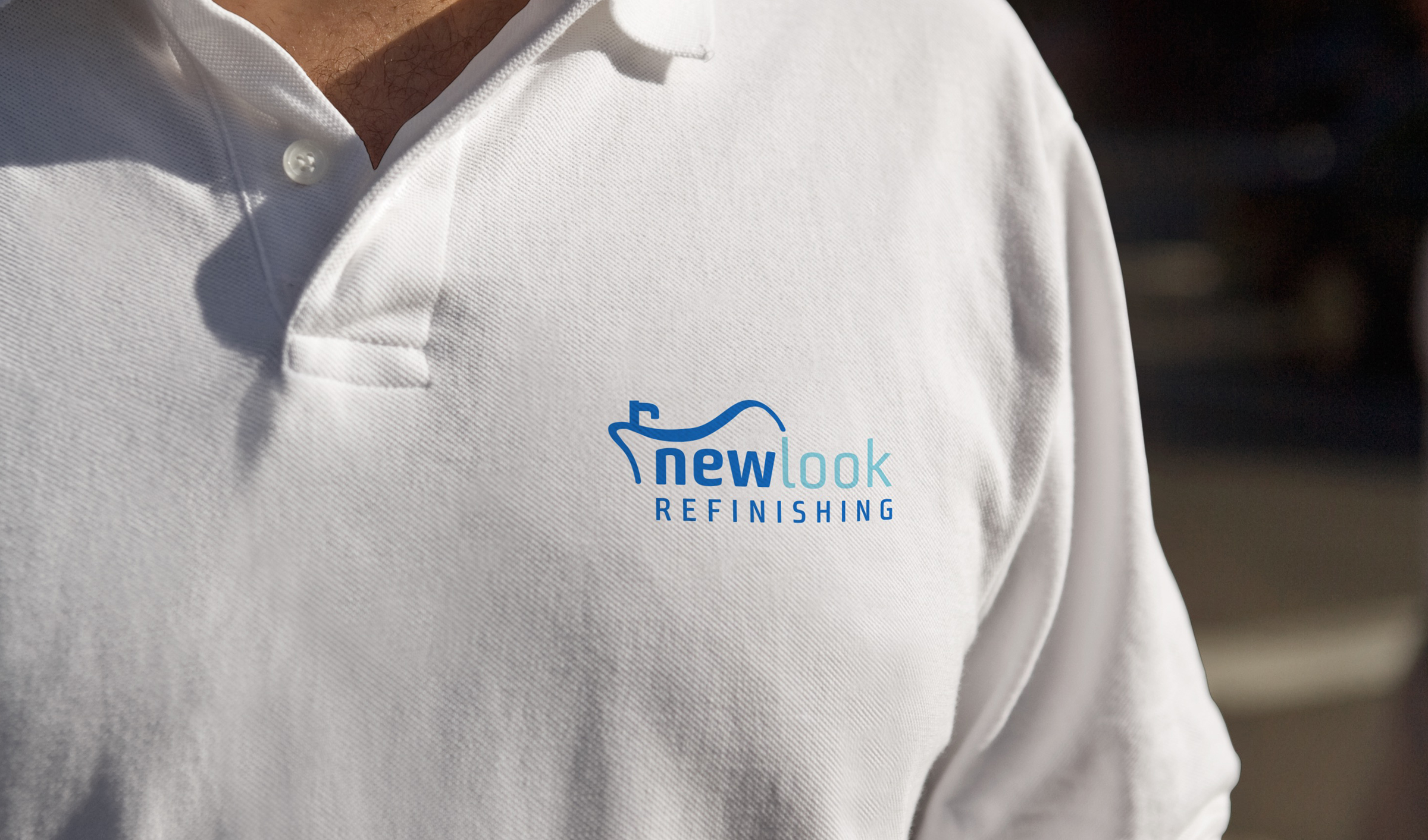
The client is a company in Abington, MA that specializes in refinishing bathtubs, countertops, and tile work. Their primary business, however, is bathtub refinishing - a process that is significantly quicker and more cost efficient than renovations. The client was hesitant about changing the logo they had used for 12 years, but he knew it was time to update and simplify the logo for his growing business. The objectives of this project were to create a logo that was simple, straightforward, professional, and clarified what the company does.
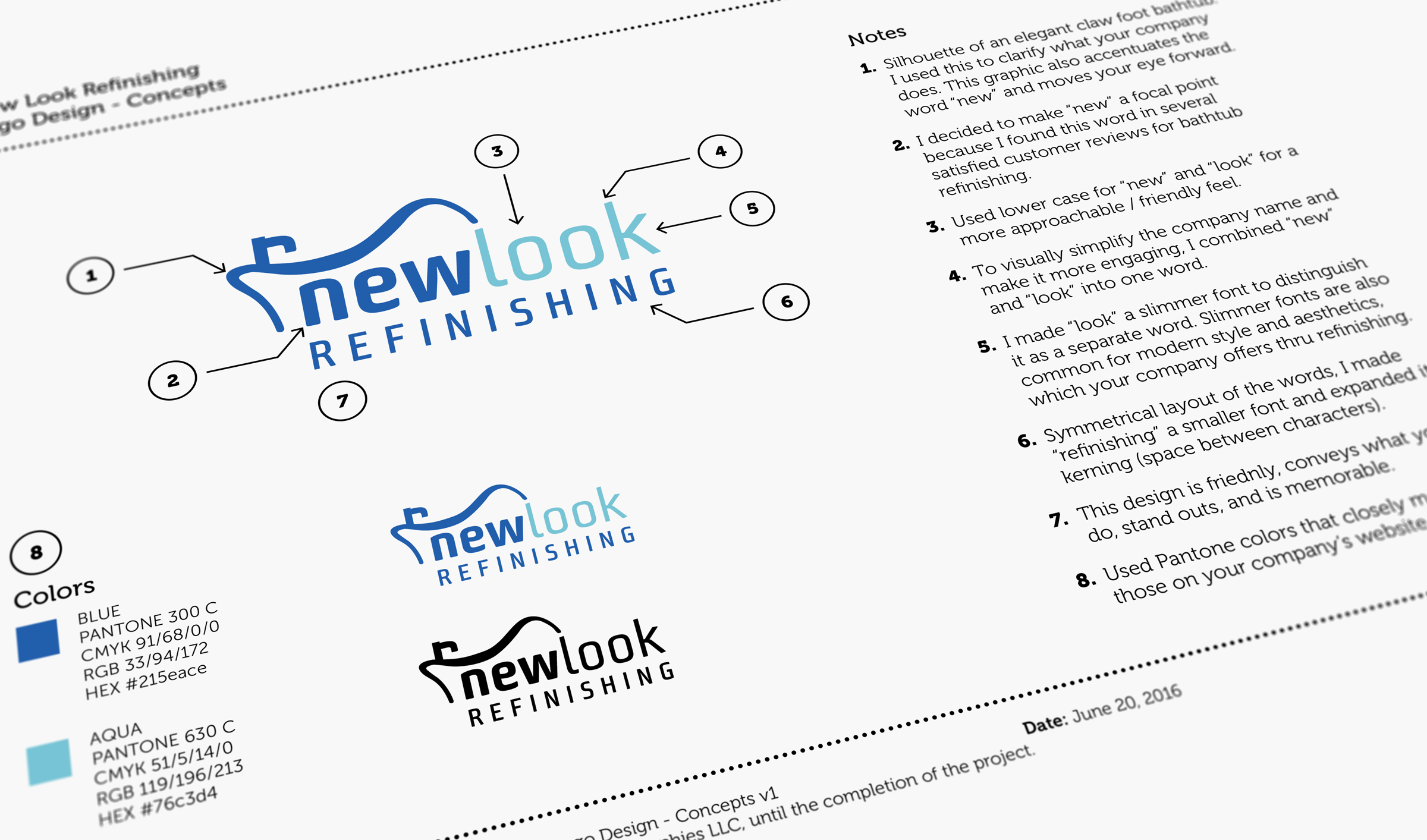
My research of customer reviews for bathtub refinishing revealed that almost all satisfied customers used the word "new" to describe the outcome. Therefore, I decided to highlight the word "new" in the logo by bolding it. In addition, adding the silhouette of an elegant claw foot bathtub on top accentuated the word "new" as well as helped clarify what the company does. The end result is well balanced, memorable, straightforward, and most importantly made the client very happy with the result.
Feedback
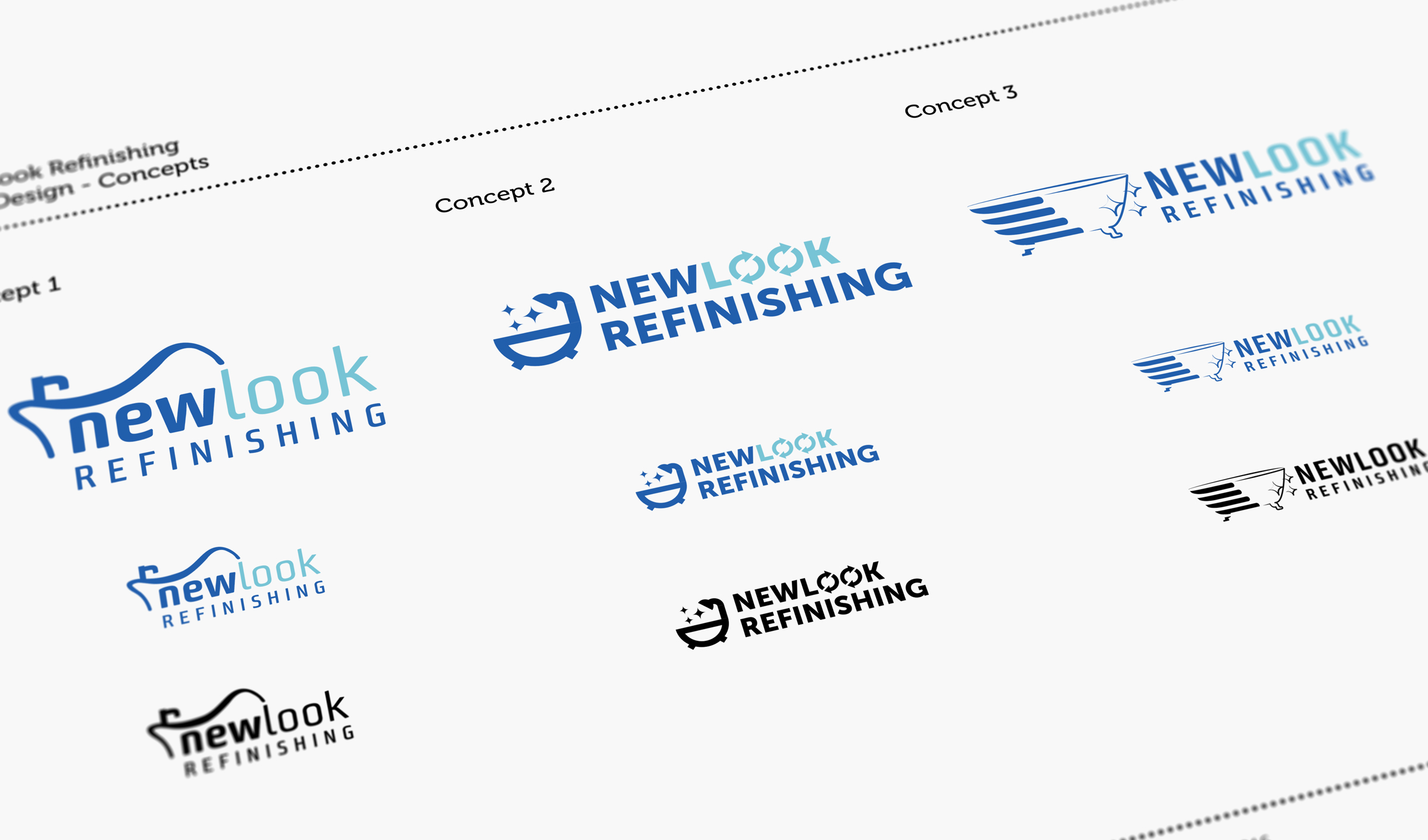
"I must say I was very happy with what you came up with. I'm sure some customers say ( after viewing the new logos ) 'that's it? I could have done that.' Well, let me assure you, I couldn't have done that. I don't have the eye for design and symbolism that you do. All 3 concepts look clean, balanced and professional."
Logo Design
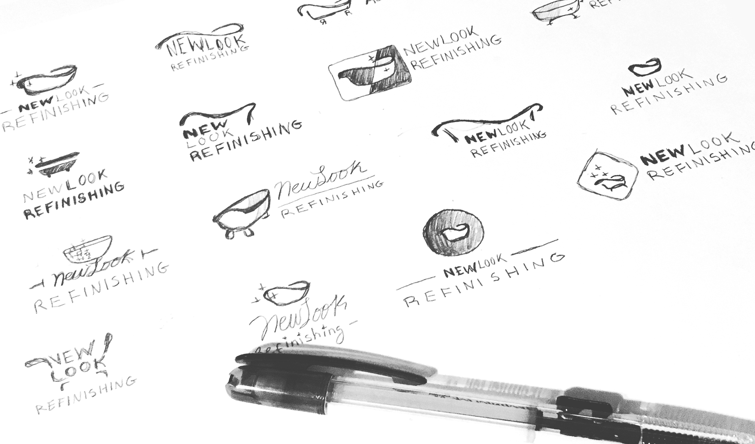
Brainstorming / Logo Design Sketches
Logo Design Concepts
Logo Design Presentation
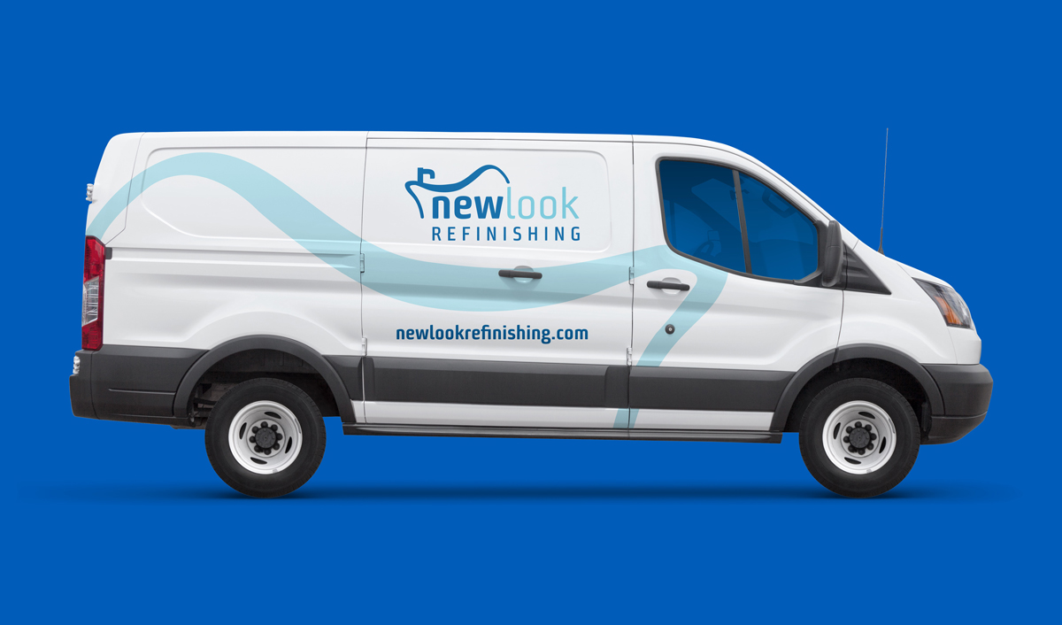
Branding


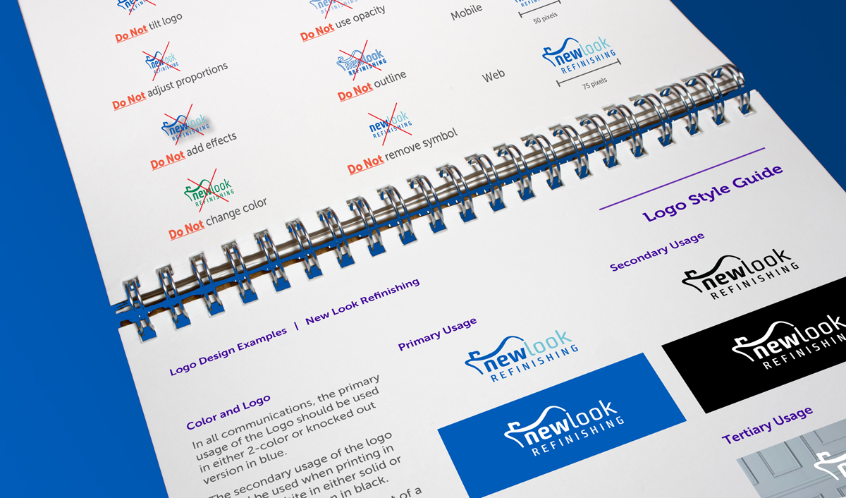
Logo Guidelines
