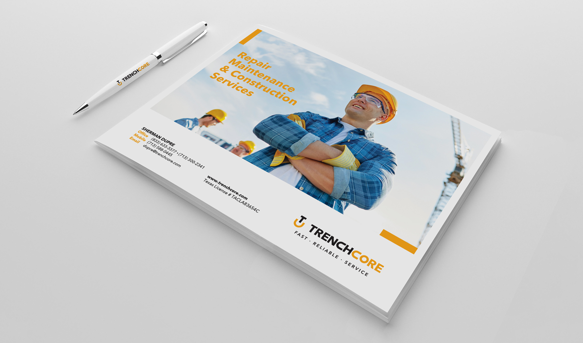
Logo & Brand Identity Design
Client
TrenchCore
Project
TrenchCore is a construction company located in Texas. For over 20 years they have specialized in the repair, maintenance, and construction of both commercial and residential structures. Their expertise includes mechanical, electrical, and plumbing services. From large multi-million dollar fast-track projects to simple repairs, their mission is to provide their customers with best in class service and support that truly sets them apart from competitors.
I was approached by the president of the company. He was looking to completely redesign their existing business logo and brand identity. The company was experiencing rapid growth in recent years and wanted to establish a stronger and more distinctive brand identity that could grow with them. The old logo had only been used for about 2 years. However, it was time for a refresh. The goal was to create a logo and brand identity that better reflected their growing business and conveyed a more easily identifiable, corporate, and professional brand.
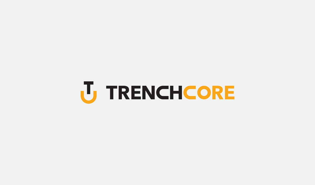
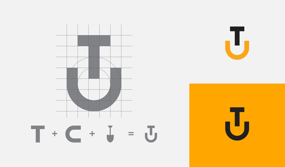
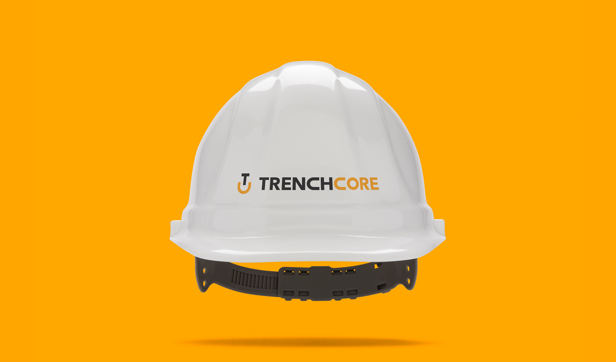
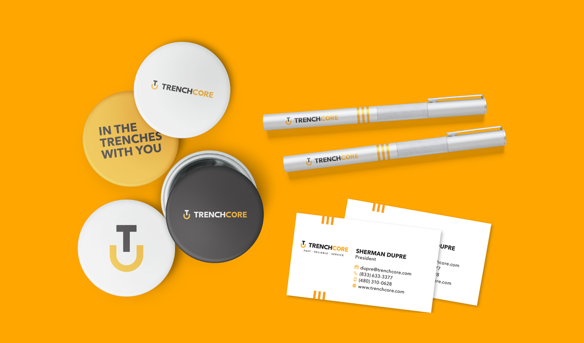
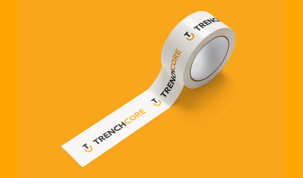
One of their requests was to incorporate either a shovel or hard hat into the logo design. In this design, I decided to incorporate that imagery in the logo symbol. The logo symbol illustrates a minimalist shovel that is made up of the initials “T” for Trench and “C” for Core. So when the symbol is used by itself, the initials and shovel shape can help remind customers of the business name. The negative space between the “T” and “C” create a “U” shape that represents a trench, giving the logo added meaning and appeal. Lastly, the symbol was created using a grid to achieve good balance and symmetry, which enhances the symbol’s appeal to our nonconscious brain. The simplicity of the symbol’s design makes it distinctive and more memorable. The typeface was customized so that the “C’s” were slightly less rounded and matched the “C” used in the logo Symbol.
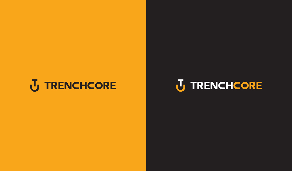
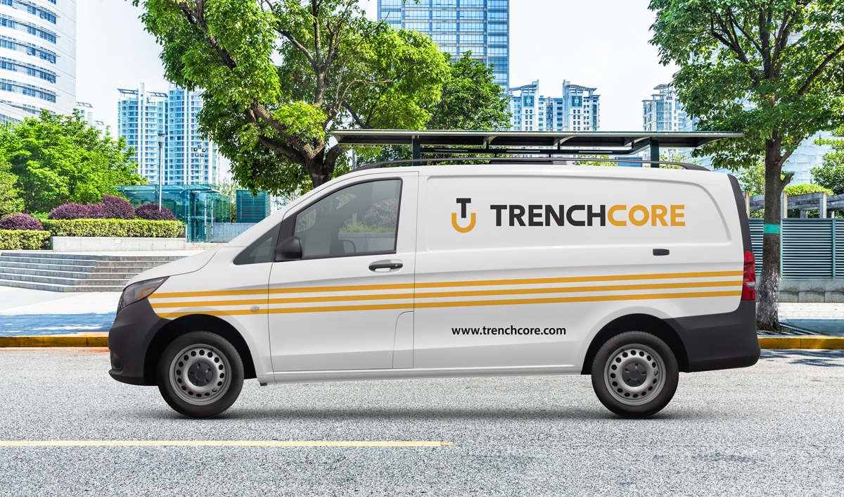
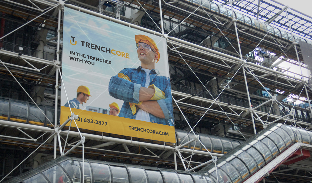
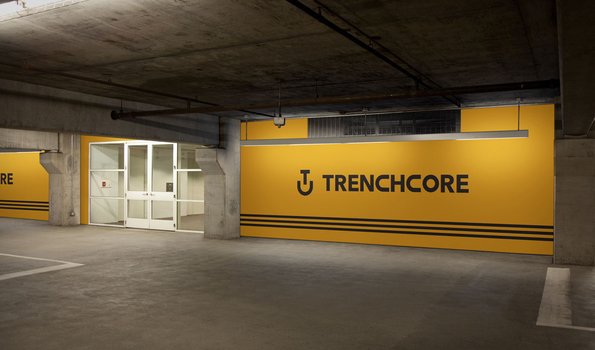
The end result is a minimalistic yet sophisticated logo, designed to be more identifiable, with a corporate flair, that conveys professionalism, strength, and reliability. It also has better flexibility, allowing them to use it in many different applications.
Feedback
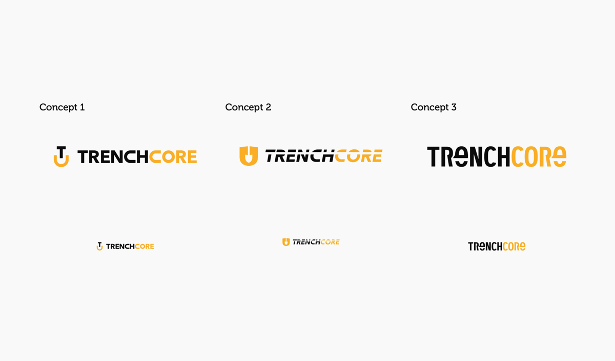
"Del designed the logo exactly how I wanted it. I was very excited about all of the design concepts presented. However, he nailed it with design #1 from the beginning. It captures everything I was looking for in a business logo. It's distinctive, bold, strong, symbolic, simple, and clean. "
Sherman Dupre / President
Logo Design
Logo Design Presentation
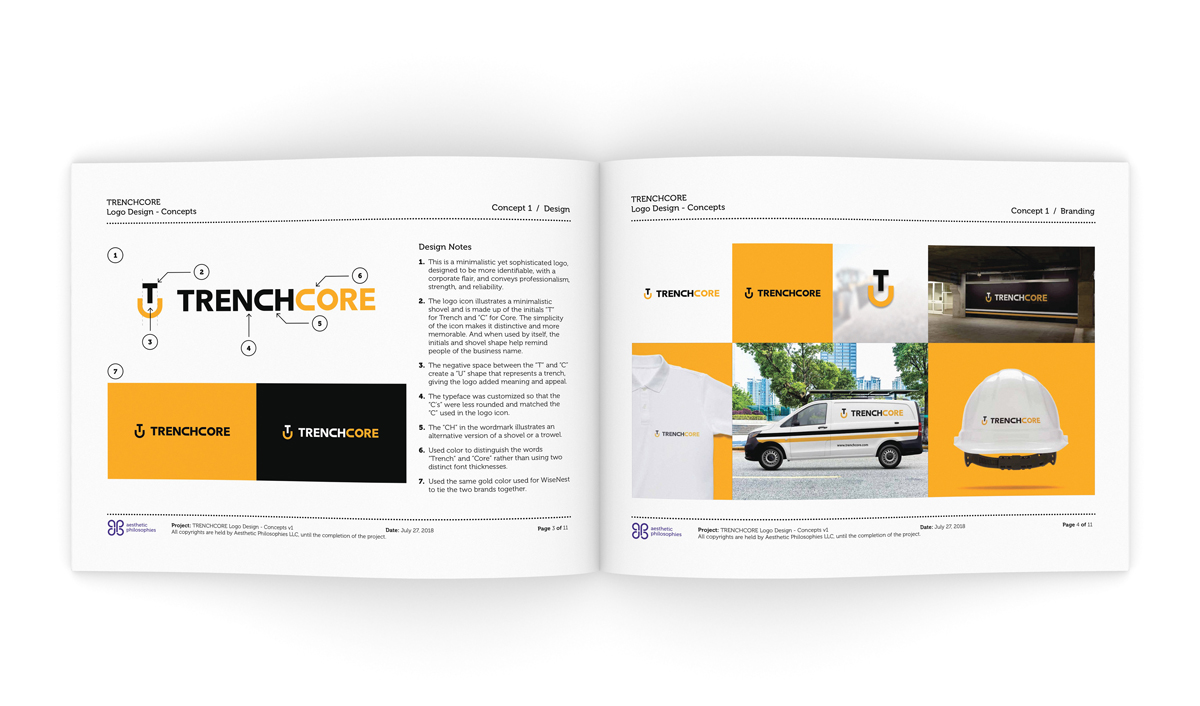
Logo Design Concepts
Symbol Design and Grid Work
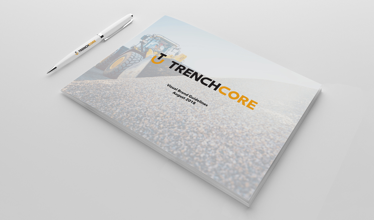
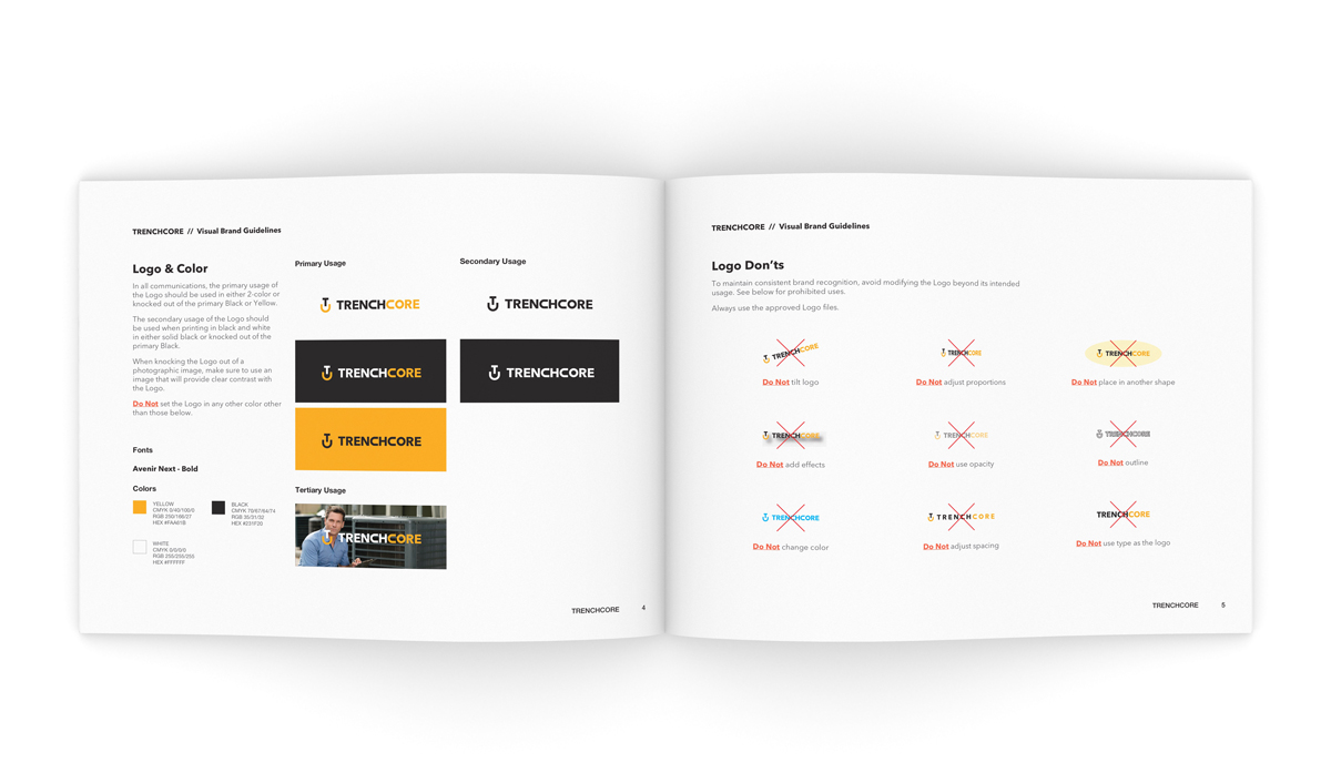
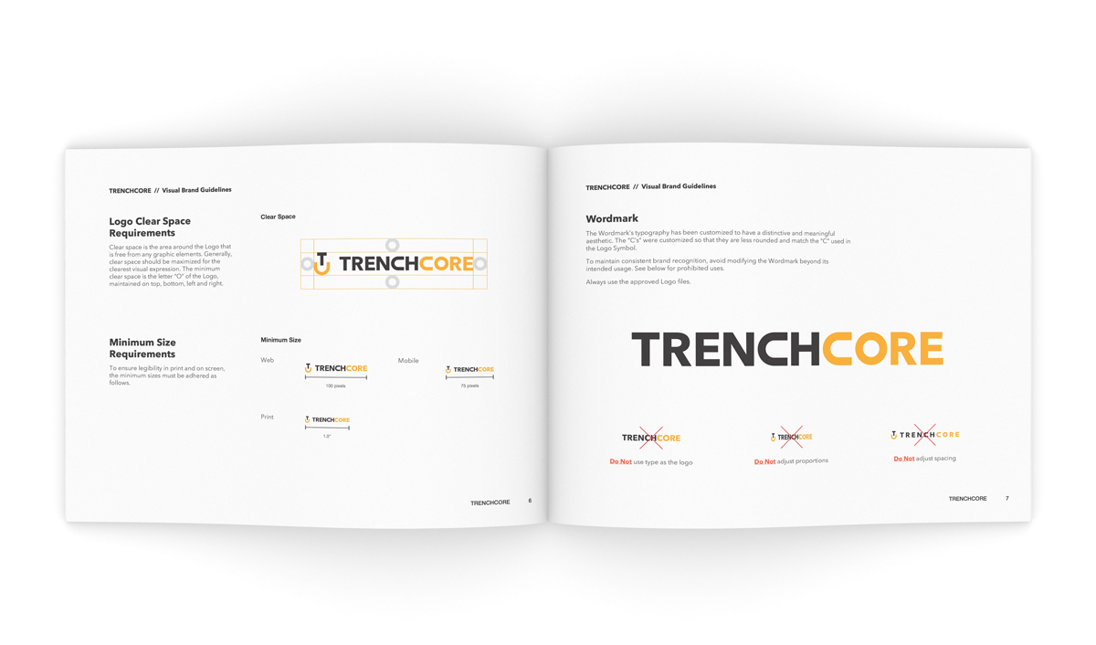
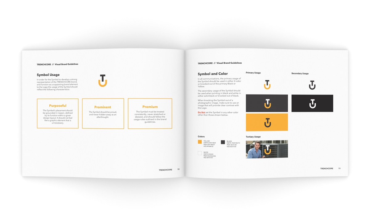
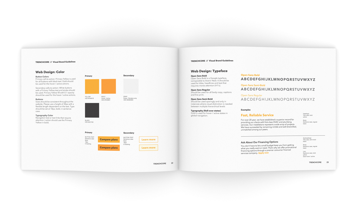
Visual Brand Guidelines
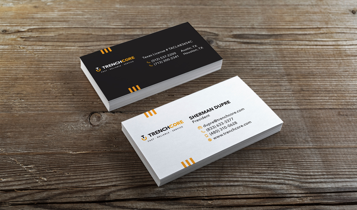
Business Card Design
Branding

Company Presentation
