The stakes for the modern logo to cut through the noise are higher than ever. The average person is exposed to nearly 5,000 branded messages a day. And logos continue to play a significant role in how a brand is perceived. Thus, logo designers have to be even more strategic about creating designs that capture the attention of people and shape the right impressions. Creating logos with more clarity and inherent appeal can give a business the chance to captivate the public in the few seconds it has to make an impression. This article will discuss how to create better logos using scientific evidence about how the brain responds to images.
“What other antidote to clutter can there possibly be except simplicity?" - Luke Sullivan
Related: What Makes a Logo Great?
Harness Neuro Design Principles
When it comes to taking a more strategic approach to logo design, neuro design is a great resource. Simply put, neuro design is about creating more effective designs through the use of insights from psychology and neuroscience about how the brain responds to design. Neuro design provides a set of principles that allows you to test logo designs against real human reactions. Consequently, you can create logos that instinctively appeal to the human brain. Logo designers have long relied on design principles and intuition to create effective logos. Neuro design can help them get a grasp on the basic mental principles driving design effectiveness.

If you would like to learn more about neuro design, then I would recommend getting a copy of Darren Bridger’s book Neuro Design: Neuromarketing Insights to Boost Engagement and Profitability. The book discusses the significant role our non-conscious brains play in how we react to designs, and how to create more effective designs that appeal to our non-conscious brains directly. Most designers understand what works in logo design. Neuro design provides answers to why design works. As a result, logo designers can make better and more strategic design decisions backed by scientific evidence.
“Attention is a psychological commodity, and neuroscience can teach us how it works." - Darren Bridger
Related: 5 Goals for Small Business Logo Design
Use Minimalistic Design and Rich Meaning
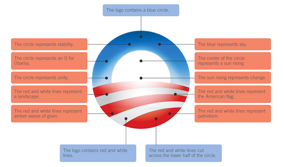
Minimalistic logo design continues to be a popular and effective trend. In fact, this trend is the only one that stands the test of time. More and more brand logos are becoming simpler, achieving more clarity and efficiency. Research shows that our brains have evolved to prefer images such as logos that are easy to process. When a logo is easy to decode, it has high processing fluency. There is evidence that shows fluent logos tend to appeal to us more1. It’s no surprise why minimalistic design has been so popular and successful in recent years. Thus, minimalistic logo design is scientifically proven to appeal to our brains in an instinctive way. However, design that is too simple risks becoming boring and unappealing. And the only antidote is to insert rich meaning into the design. Propositional density is the measure of the number of meanings logo elements convey divided by the number of design elements used. When the result is greater than one, the logo has rich meaning.

Often designers think that by adding more visual elements to a logo, the more sophisticated it is. That is simply not true. The most memorable and sophisticated logos are those that are simple and possess rich meaning. The Obama’s campaign logo is a great example of a logo that contains many layers of meaning and uses few visual elements. Using the concept of propositional density can help you add design elements more purposefully and keep logos simple and meaningful. Logos with high propositional density are more interesting and memorable, and can transcend logos that are just simple2.
“Simplicity is the ultimate sophistication” - Leonardo da Vinci
Related: 3 Doubts Clients Have About Logo Design and How to Refute Them
Leverage the Power of Curves and Cusps
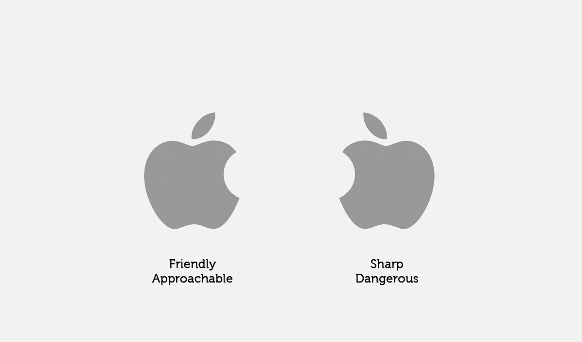
People have an innate preference for curves over angular or sharp designs. So implementing curves into logo design is an effective way to make it more captivating. One study revealed that when participants were shown both a curvy design and an angular design, they would look at the curvy design first3. Evidence from further studies concluded that the brain’s preference for curves is primitive and universal4. Because curves are more unusual to occur in nature, they instinctively pique our interest. In design, curves or tapered shapes make designs approachable and easy as well as encourage engagement. Cusps can also be used to grab our attention. That is because they remind us of things that can hurt us, like a thorn or a knife for example. Because these shapes signal danger and fear to our brain, the brain has learned to drive our attention to them quickly. Before you use curves and cusps in your logo design, consider whether these shapes evoke the right feelings and are appropriate for the brand.

The Apple logo uses the perfect blend of curves and cusps to create a highly compelling and memorable logo. It is also important to note that our brains have a tendency to pay more attention to visual elements in our left visual field. Note how the largest curve in the Apple logo is on the left side, creating a soft and appealing look. While the cusps created by the “bite” are on the right side where we notice them less. If we flip the logo horizontally, it does not have the same appeal. In the right application, you can leverage curves and cusps to make logo designs more attractive to our brain.
“Generally, people prefer curved shapes over angular or spiky ones." - Darren Bridger
Related: Why Small Businesses Need Strong Logos
Use Patterns to Pique Interest

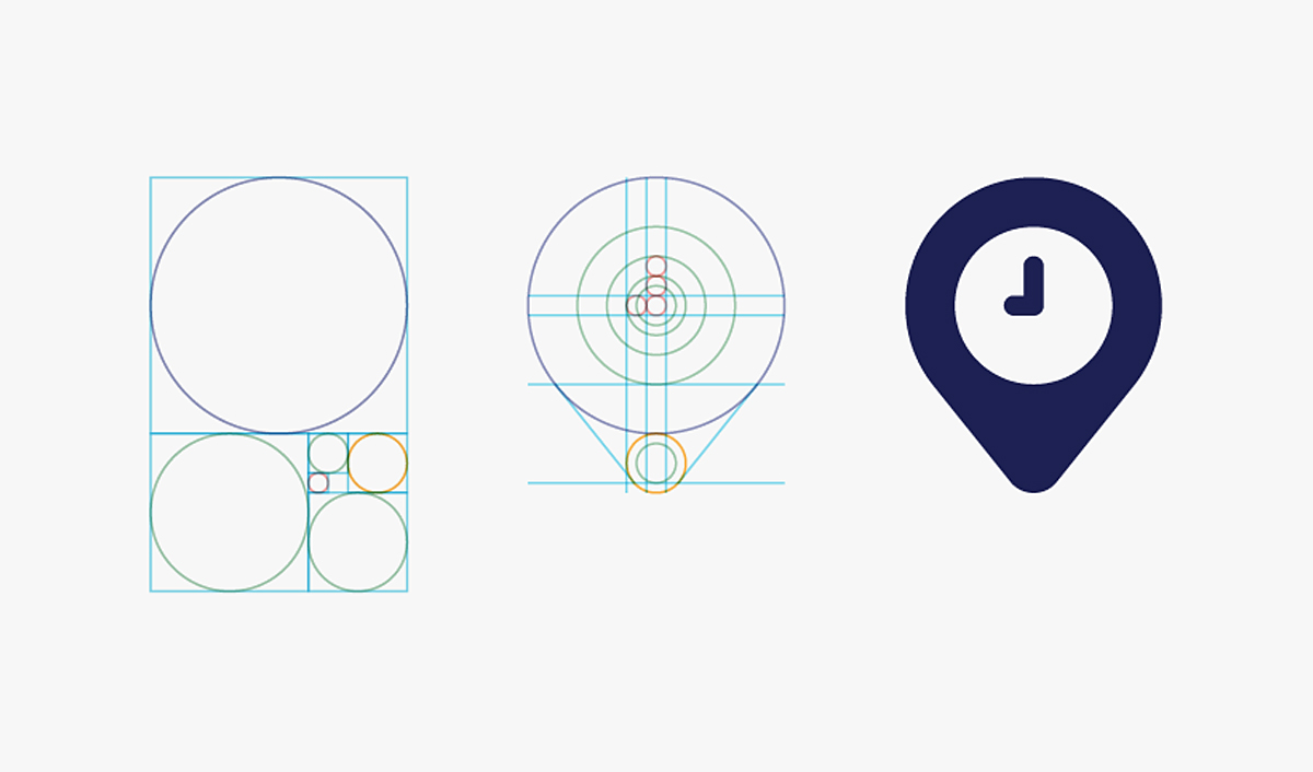
Did you know that our brains love patterns? The brain is constantly creating cognitive shortcuts to save energy. And it likes patterns because they are easy to process and remember. They provide a sort of shortcut the brain likes. As a result, the brain has an innate bias towards discovering and learning patterns5. This is the core of human curiosity according to neuroscientists. In logo design, patterns can be applied in a number of ways: grid design, symmetry, and the golden ratio. Grids provide a way to introduce patterns into designs. They have long been used by designers to create simple yet captivating logos. Though a grid or pattern is not immediately obvious, evidence from eye-tracking studies suggests that people can non-consciously sense hidden geometry in a design6. Adding patterns or geometry to logos makes them more effective at piquing our brains’ curiosity and increasing memorability.
“True simplicity is derived from so much more than just the absence of clutter and ornamentation. It's about bringing order to complexity." - Jony Ive, Apple's Lead Designer
Related: The Logo Design Process
Designing Logos that Impress and Stand Out
Creating a logo that adequately identifies a brand is half the battle. Designing a logo that impresses and rises above the crowd has become a more critical goal in branding. Considering how our brains innately respond to logos can add another layer of strategy to your logo designs. You will make more informed and strategic design decisions. As a result, you will deliver better logos that are much more compelling and effective.
References
- Bridger, Darren. Neuro Design: Neuromarketing Insights to Boost Engagement and Profitability. 1st ed., KoganPage (February 28, 2017), pp.43
- Martindale, C, Moore, K and Borkum, J (1990) Aesthetic preference: anomalous findings for Berlyne’s psychobiological theory, The American Journal of Psychology, 103(01) pp. 53-80.16
- Bar, M. and Neta, M., 2006. Humans prefer curved visual objects. Psychological science, 17(8), pp.645-648.
- Amir, O, Biederman, I and Hayworth, KJ (2011) The neural basis for shape preferences, Vision Research, 51 (20), pp. 2198-206.
- Bridger, Darren. Neuro Design: Neuromarketing Insights to Boost Engagement and Profitability. 1st ed., KoganPage (February 28, 2017), pp. 54
- Bartlett, C (2011) The eyes have it: focal point choices and compositional geometry in painting, Proceedings of Bridges 2011: Mathematics, music, art, architecture, culture , pp. 489–92, Tessellations Publishing.
If you liked this article, subscribe to receive the Aesthetic Philosophies newsletter.

